
Climate cherry picking

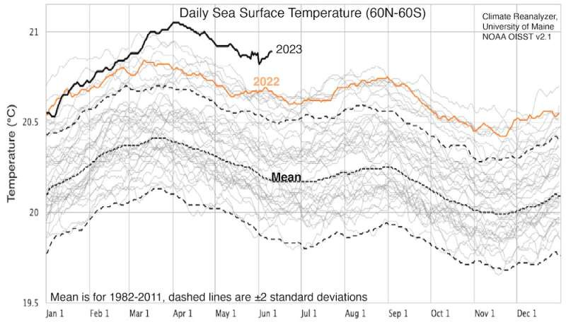
The image above has been widely shared on social media. It shows that since mid March, the sea surface temperature between latitudes 60S and 60N is the highest since the data series started to be collected.
Bill McKibben, never shy to exaggerate, calls it “one of the most iconic images in the history of the climate fight.” (Last week I read the same about images of smoke-filled New York City, but I guess history moves fast these days.)
People sharing this graph are implying it means the planet is warming faster than previously thought.
They usually minimize or entirely omit the fact El Niño has arrived and hottest years are usually El Niño years.

People sharing the first graph are basically saying that it is fine to make sweeping conclusions about climate change because a single metric has been the highest so far for a grand total of 3 months.
In other words, they are cherry picking data to make their point.
They are playing the same game as people who imply there is no global warming every time there is a winter storm or when the Arctic ice extent is greater than modeled for a few months.
Let’s go back to basics. The IPCC conducts careful assessments aimed at evaluating and synthesizing often conflicting studies. It has shown that mean surface temperatures have increased by about 1.3C since the 1850s and are likely to increase by 2-3C total (vs 1850) by 2100 under reasonable assumptions.
All the cherry picking by one “side” or the other isn’t helpful. It undermines the IPCC as a scientific organization and makes it harder to make rational decisions about climate change — how much we should be reducing CO2 emissions (if at all), what are good ways to reduce them, and how quickly we should do that.
"People sharing the first graph are basically saying that it is fine to make sweeping conclusions about climate change because a single metric has been the highest so far for a grand total of 3 months."
I don't think this is a fair read at all. Maybe if you provided some of the commentary people are saying, there'd be more evidence for this claim. As it stands, you're reading quite deeply into people's minds without citing much evidence. I'd share this picture. It's real. It's relevant. It's informative. Not only is the metric higher, it's much higher, and it's been growing higher over time. And the metric is, well, the average temperature on Earth. A pretty clear, simple, valuable metric if ever there was one. Everyone knows temperature.